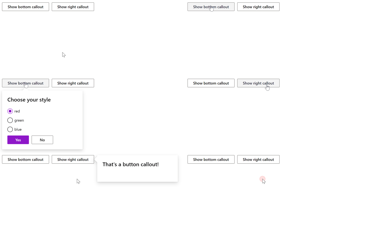
Callout
A callout is an anchored tip that can be used to teach people or guide them through the app without blocking them.

Callout can be "attached" to the following controls:
- Button
- MenuItem (Button and Toolbar)
- Checkbox
- Dropdown
- Link
- Slider
- SearchBox
- ChoiceGroup
- SpinButton
- Textbox
- Toogle
Properties
| Name | Type | Default | Description |
|---|---|---|---|
target | string | Id of the control to which the collout is attached. | |
position | string | bottomAuto | The position of the callout relative to the target control: topLeft, topCenter, topRight, topAuto, bottomLeft, bottomCenter, bottomRight, bottomAuto (default), leftTop, leftCenter, leftBottom, rightTop, rightCenter, rightBottom. |
gap | number | 0 | The gap between the callout and the target control. |
beak | bool | true | Whether the beak is visible. |
beakWidth | number | 16 | Beak width. |
pagePadding | number | 8 | The minimum distance the callout will be away from the edge of the screen. |
focus | bool | false | If true then the callout will attempt to focus the first focusable element that it contains. If it doesn't find an element, no focus will be set and the method will return false. This means that it's the contents responsibility to either set focus or have focusable items. |
cover | bool | false | If true the position returned will have the menu element cover the target. If false then it will position next to the target. |
visible | bool | false | Whether the callout is visible or not. |
Events
| Name | Description |
|---|---|
dismiss | Fires when the callout is dismissed. Callout is dismissed when a user clicks outside of the callout area. |
Child controls
- Any control - will be rendered in the body of the callout.
Examples
- Python
- Bash
- PowerShell
- Node.js